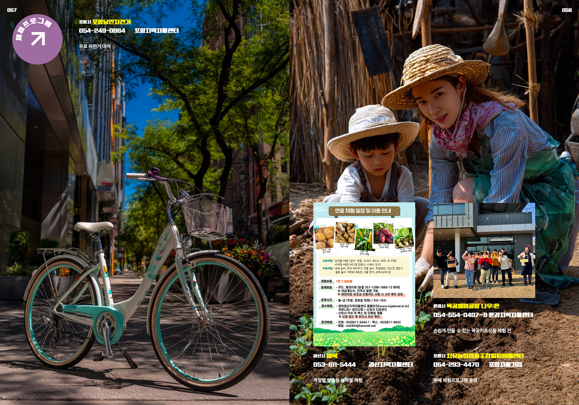
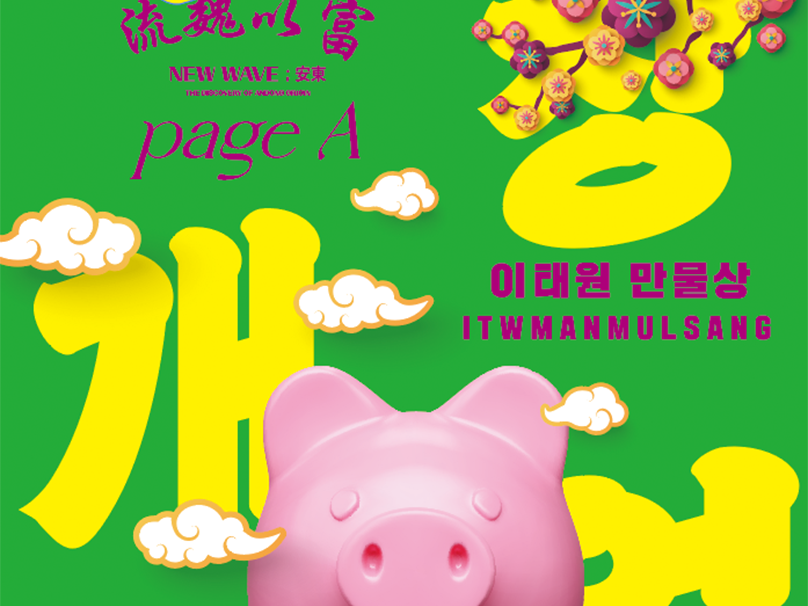
I worked on a catalogue introducing Gyeongsangbuk-do’s self-support products and services, departing from the conventional, standardized format to explore a more liberated approach. By adopting a B-grade aesthetic—resembling a bundle of loosely assembled flyers—I aimed to infuse vitality and character into what is typically a purely informational medium.
The text was deliberately divided into two distinct layers: one for clear, structured information, and the other for expressive, evocative copy. This contrast allowed both readability and emotional impact to coexist.
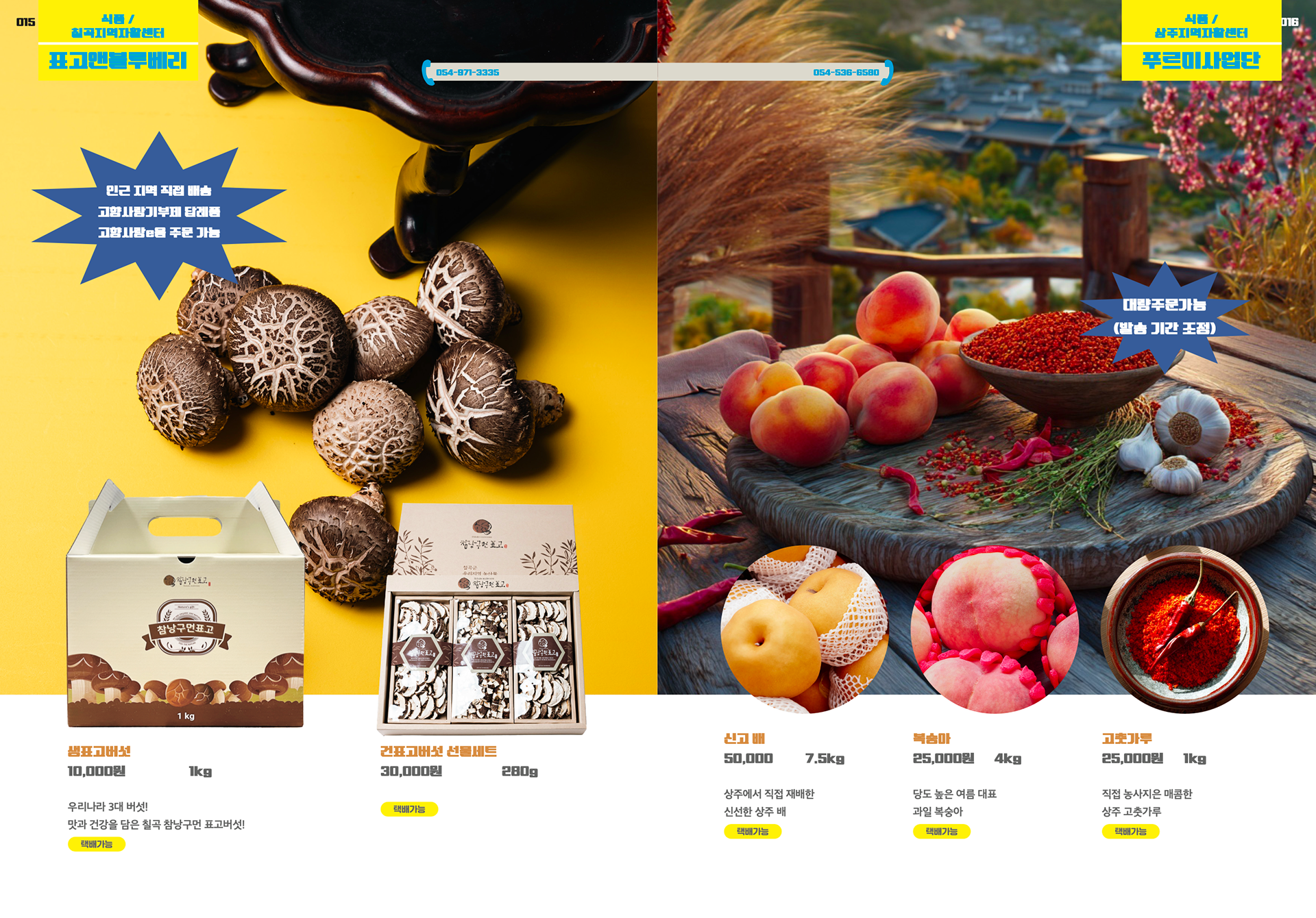
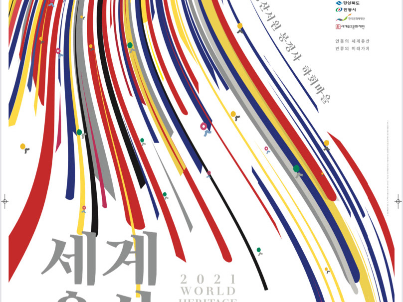
Rather than relying on the muted or pastel tones commonly found in traditional catalogues, I chose to embrace bold, primary colors, creating a striking visual presence.
Ultimately, this work aspires to move beyond the function of a simple guide, becoming a catalogue that first engages the viewer through sensation and visual rhythm.